.svg)

Lorem ipsum dolor sit amet, consectetur adipiscing elit, sed do eiusmod tempor incididunt ut labore et dolore magna aliqua.


As a UI/UX Developer at CenturyLink Technologies, I spearheaded the analysis of user interview transcripts, crafted intuitive design solutions, and implemented front-end technologies to enhance B2C and B2B applications. My efforts led to significant reductions in customer care support needs, lowered error rates, and substantial improvements in user engagement and satisfaction using the Self-Service Console dashboard tool.
.png)
CenturyLink stands as a trusted leader in the telecommunications industry, delivering comprehensive communication and technology solutions that connects people, businesses, and communities, driving progress and shaping the future of connectivity.
As a leading provider of integrated communications solutions, CenturyLink serves a diverse customer base, including small businesses, large enterprises, government agencies, and residential consumers. The company is committed to delivering reliable, secure, and innovative communication services that empower businesses, enhance connectivity, and enrich the lives of individuals and communities worldwide.
With a focus on digital transformation and innovation, CenturyLink continues to invest in advanced technologies and infrastructure to support the growing demand for bandwidth-intensive applications, cloud services, cybersecurity solutions, and digital experiences. Through strategic partnerships and collaborations, CenturyLink aims to drive digital inclusion, foster economic growth, and enable organizations to thrive in an increasingly connected world.
As a UI/UX Developer of the Repair Experts team at CenturyLink Technologies, I contributed to two key projects: the Customer Service Console (CSC) and the Self-Service Console (SSC) Dashboard Tool. The CSC served as a platform for customer care representatives to manage support tickets, while the SSC Dashboard Tool aimed to empower customers to troubleshoot their own issues, reducing reliance on CSC and minimizing support inquiries.
Despite advancements in technology and customer support strategies, CenturyLink Technologies faces persistent challenges in delivering an optimal customer experience through its Customer Service Console (CSC) and Self-Service (SSC) Dashboard Tool. These challenges manifest in several key areas:
In leveraging Agile UX methodologies, we adopted a streamlined and iterative process to enhance the Self-Service Console (SSC) tool and maximize user engagement effectively. This approach facilitated rapid prototyping, continuous feedback loops, and adaptive development practices, ensuring alignment with user needs and business goals throughout the project lifecycle.
The introduction of the Self-Service Console (SSC) tool at CenturyLink resulted in a 30% increase in weekly users, 20% increase in first-call resolution rates for customer support interactions, further emphasizing the tool's effectiveness in empowering users to resolve issues independently or solving through CSC dashboard, and $100,000 in quarterly cost savings.
I have been granted permission to share a single design example of the Customer Service Console (CSC) dashboard, as other designs are subject to non-disclosure agreements (NDAs). This specific design showcases elements of the CSC dashboard's Call Wrap Up flow showcasing a small glimpse of the user interface, illustrating its layout, and functionality.

Engaging in diverse tasks spanning UX research, design, and development has enriched my skill set and provided me with extensive industry experience. Through utilization of tools such as Nokia SMP workflow builder, Adobe XD, Miro, and project management platforms like Jira, alongside proficiency in programming languages like HTML, CSS, JavaScript, and React, I've honed my abilities and contributed effectively to multifaceted projects.
Collaboration between designers, developers, product owners, and stakeholders was essential for successful project outcomes. Open communication, shared understanding of project goals, and a collaborative mindset enabled us to leverage each team member's expertise and collectively drive the project forward.
Embracing agile methodologies, particularly the Scrum framework, facilitated efficient project management and collaboration. Regular sprint cycles, daily stand-up meetings, and sprint retrospectives helped keep the team aligned, identify obstacles early, and adapt to changing requirements quickly.
Redesigned the brand identity of Redwood Preschool & Daycare, crafting a new logo and website to showcase their enduring commitment to nurturing young minds over eight years.
View WebsiteRedwood Preschool & Daycare, situated in Bangalore, India, has been a cornerstone in the nurturing and development of young minds in the preschool and daycare sector for over eight flourishing years. The school owner is deeply committed to nurturing young minds. Her vision is to create a supportive community focused on holistic child development. I've had the privilege of revamping the school's brand and online presence by creating a strong brand identity, a well-structured information architecture, strategic web design, and development.
%20(699%20x%20399%20px)%20(1200%20x%201800%20px).svg)
This is the finalized version of the website, achieved after an extensive process of iterative research, design, and development.

The below are the outcomes observed with a significant increase in the measures.
To address the issues identified with the previous website, I approached the problem using the design thinking methodology, which emphasizes empathy, ideation, and iteration to find innovative solutions.

The insights were gathered from 10 participants who have previously enrolled their children at Redwood Montessori. During this exploratory research, I aimed to answer a few key questions:
1. What factors do parents consider when determining if a childcare center is trustworthy?
2. What criteria do parents use to select a childcare center for their children?
3. How do parents prefer to communicate with childcare centers like Redwood Montessori?
%20(699%20x%20399%20px)%20(1200%20x%201800%20px)%20(3).svg)

"I trust a childcare center when they clearly communicate their approach to early childhood education and safety measures."

"When a childcare center adopts the Montessori method, I feel a sense of trust knowing they prioritize my child's holistic development."

"Using WhatsApp to ask questions makes it easy for us to talk with the childcare center. It helps us communicate quickly."
Based on the insights gathered from the research learning with parents who've enrolled their children at Redwood Montessori, we can create user personas to represent the typical parent demographic. These user personas reflect the key insights gathered from the research and highlight the diverse needs and preferences of parents when choosing a childcare center like Redwood Montessori. Through these personas, the nuanced expectations and desires of parents are succinctly captured. This strategic approach ensures that Redwood Montessori can align its services and communications effectively, meeting the expectations of its diverse parent community.
.png)
After conducting exploratory interviews, analyzing competitors, and identifying Redwood's strengths, I developed a comprehensive content strategy document for the web interface. This involved crafting compelling messaging that resonates with our target audience while highlighting Redwood's unique offerings.Additionally, recognizing the importance of visual identity, I decided to create a new logo to further enhance brand recognition and cohesion. Incorporating user insights and best practices in UX writing, the content strategy aims to provide an engaging and informative experience for visitors, ultimately driving engagement and conversions.
%20(699%20x%20399%20px)%20(1200%20x%201800%20px).png)
I began generating design solutions by developing information architecture and creating low-fidelity mockups through sketching.

These concepts were then transformed into high-fidelity mockups.
.png)


1. Clarity on Programs Offered: Provide detailed information about daycare and preschool programs to clarify differences.
2. Aesthetic Improvement: Revise color scheme for a more visually appealing website design.
3. Addressing White Spaces: Optimize layout to reduce excessive white spaces while maintaining readability.
4. Detailed Facility Information: Provide comprehensive details about school amenities and resources.
5. Section on Daily Routine: Include a dedicated section detailing a typical day at the school.
%20(699%20x%20399%20px)%20(1200%20x%201800%20px)%20(4).svg)
Despite the project's immediate requirements not mandating the use of React, I opted for it. My rationale was to establish a foundation that could seamlessly accommodate future expansions. This strategic decision ensures scalability, allowing for the incorporation of additional functions and features if the client decides to enhance the website in the future.
%20(699%20x%20399%20px)%20(1200%20x%201800%20px)%20(1800%20x%201200%20px)%20(1).svg)

Prioritizing user research and insights allowed for a deep understanding of parents' needs and preferences when choosing a childcare center. This informed the design and development process, ensuring that the website exceeded user expectations.
Developing a cohesive visual identity, including a new logo and color scheme, enhanced brand recognition and cohesion. Visual elements play a crucial role in conveying the school's values and creating a welcoming and trustworthy online presence.
The iterative design process, including ideation, low-fidelity mockups, and high-fidelity mockups, allowed for continuous improvement based on user feedback.
Opting for React in development, despite immediate project requirements not mandating it, showcased a forward-thinking approach. This decision ensures scalability and flexibility for future expansions or enhancements to the website.
Lorem ipsum dolor sit amet, consectetur adipiscing elit, sed do eiusmod tempor incididunt ut labore et dolore magna aliqua.
Housync is a visionary web application tailored to aid individuals, particularly those transitioning to foreign countries, in securing ideal accommodations, compatible roommates, and vibrant communities.
Housync addresses the common challenges encountered by expatriates when seeking accommodations, roommates, and community connections abroad. With a focus on facilitating seamless connections, our platform aims to streamline the relocation process by providing users with precisely tailored solutions to meet their needs in a new country.
Many internationals struggle with understanding the housing market in a foreign country, and finding roommates can be a daunting task. Even with the help of online resources like Google Maps, it can be tough to navigate through a new city and get a sense of its various neighborhoods. That's where our application comes in! Our goal is to provide a comprehensive guide to a city and country, while also helping users find their perfect living situation, whether it's renting, buying, or finding compatible roommates.
.png)
The user interviews involved 12 individuals who were either planning to move abroad or had recently relocated to a foreign country. Participants included students, professionals, and expatriates from diverse cultural backgrounds.
Five competitor websites were selected for analysis based on their popularity, relevance to the target audience, and the services they offered in assisting with relocation.
Lack of Comprehensive Solutions: Through competitor analysis, it was evident that existing platforms did not fully cater to the needs of international users seeking accommodation.
Limited Support for Co-living Searches: None of the competitor apps offered robust support for co-living searches, indicating a gap in the market.
Complex User Interface Designs:
Some competitor platforms featured cluttered layouts and complex navigation structures, which could overwhelm users and hinder their overall experience.

After analyzing the gathered data, I identified common trends and important insights. This helped to understand what our target users are like and what they need. I created user personas, which are fictional characters that represent typical users. These personas give us valuable information about who our users are, what they want to achieve, what challenges they face, and how they prefer to interact with our product. Having these personas helped to design with the user in mind, making sure to meet the needs and create a better user experience.
.png)

The objective was to further refine the navigation and content organization identified during the mind-mapping phase. In open card sorting sessions, we sought to validate the initial structure and gain insights into user preferences for grouping and categorizing features. This iterative process ensured that the final information architecture of Housync was not only based on our internal understanding but also aligned closely with the mental models of our target users, ultimately leading to a more intuitive and user-friendly application design.

I began the design process by creating the landing page and sub navigation pages such as Home, Housing, and Roommates.
Using Figma, I designed mockups of the pages and created interactive prototypes to simulate user interactions. I iterated on the designs based on user feedback, making approximately five rounds of improvements to ensure a user-friendly experience.
.png)
.png)
.png)
.png)
It is a user-friendly platform for finding accommodation, roommates, and community connections. The goal is to make moving abroad easier and more enjoyable for users, helping them settle into their new homes with confidence and convenience.
.png)
This project aims to redesign the logo and navigation menu pages for HipHop Fish & Chicken, a fast-food restaurant serving customers primarily in Baltimore and other cities across Maryland, USA.
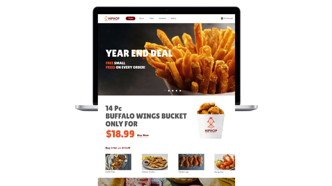
HipHop Fish & Chicken is a fast-food restaurant that specializes in serving customers primarily in Baltimore and other cities across the state of Maryland, USA. Despite offering tasty food and diverse meal plans, HipHop Fish & Chicken's website lacks appeal and frustrates users with its dull design and poor user experience. This project focuses on redesigning the logo and navigation menu pages.
1. Poor discoverability and unclear interaction cues lead to low engagement.
2. Lack of essential features like online ordering affects user satisfaction.
3. Disjointed layout and outdated design hinder quick information retrieval.
4. Violations of fundamental design principles result in a subpar user experience.
5. Addressing these issues is crucial for improving user engagement and website effectiveness.
.png)
During user interviews, 12 participants, including existing customers, frequent online food orderers, and those who visited competitor restaurants, provided valuable insights. Some common pain points identified were:
Our analysis encompassed five different competitor websites within the fast-food industry. Through this process, we identified several key observations.
Varied approaches to website design and user experience: Each competitor website exhibited unique design elements and user interface layouts, reflecting different brand identities and strategies.
Differences in features and functionalities offered: While some competitors provided comprehensive online ordering systems and detailed menu browsing options, others had more limited features or less intuitive navigation.
Opportunities for improvement: Through the analysis, I identified areas where competitor websites could be improved, such as enhancing navigation, optimizing mobile responsiveness, and refining menu presentation to enhance user experience and drive engagement.
.png)

Especially sets of Chicken and Fish icons was hand drawn initially to arrive at a design concept. The chicken head with the comb and the fish body with the caudal fin was finalized to emphasize more on the brand identity.

.png)
After creating and performing 3 rounds of usability testing with low-fidelity prototypes, the design process progressed to developing high-fidelity prototypes.

.png)
.png)
.png)
With enhanced navigation, consistent design, and discoverable elements, the site is more efficient and user-friendly. The visually appealing UI further enhances engagement, making tasks like food ordering effortless.

.png)


%20(699%20x%20399%20px)%20(5).svg)


