.svg)

During my internship at Symphony Summit AI, I developed a project aimed at automating the creation of new Azure Active Directory (Azure AD) accounts, reducing manual workload for IT administrators and minimizing errors. This project streamlines the process of onboarding new users or managing existing ones within organizations utilizing Microsoft Azure services, ultimately saving time and reducing operational costs.
Microsoft AzurePower AutomateLUISReact.png)
Azure Active Directory (Azure AD) serves as Microsoft's cloud-based solution for managing identities and controlling access to resources. It provides a centralized platform where administrators can oversee user authentication, authorization, and other security-related tasks within their organization's digital ecosystem. Azure AD facilitates seamless integration with various Microsoft services and third-party applications, enabling efficient management of user accounts, access policies, and security measures across different devices and platforms. This cloud-based identity and access management service empowers administrators to maintain robust security standards while enabling convenient access for users across diverse environments.
The primary aim of the project was to streamline the creation of new Active Directory (AD) accounts within the organization, both for new users joining the system and for existing users requiring account modifications. This objective sought to eliminate the need for manual intervention by IT administrators, thereby reducing the time and effort traditionally required for these tasks. Manual processes are not only time-consuming but also prone to errors, particularly when dealing with repetitive tasks. These errors can stem from various factors such as human oversight, inconsistencies, or miscommunication, leading to potential security risks or operational inefficiencies. Moreover, the manual workload incurred by IT administrators translates into increased operational costs for the company, making automation a cost-effective solution to improve efficiency and mitigate risks.
In the current setup, IT administrators within organizations leveraging Microsoft Azure services are responsible for manually creating new Azure Active Directory (Azure AD) accounts or adding users to the system. This process typically involves navigating through various administrative interfaces and performing tasks such as inputting user information, assigning access permissions, and configuring security settings. Given the manual nature of these tasks, administrators must dedicate time and effort to ensure accurate account creation and user management. However, this approach is not only time-consuming but also prone to potential errors or oversights, which can compromise security or lead to inconsistencies in user access across the organization's digital infrastructure. Therefore, automating the account creation and user management processes within Azure AD presents an opportunity to streamline operations, enhance security, and improve overall efficiency for IT administrators and the organization as a whole.
In this project, Skype has been used as the channel. The Skype channel passes on the request made by the user to the azure bot service. After which the bot framework connects with Luis and finds the appropriate intents with respect to the user requests and returns it back. Then, the bot framework connects with Microsoft Power Automate to perform the particular automation task requested by the user.

Through the integration of Microsoft Language Understanding Intelligent Service (LUIS), the bot comprehends the user's intentions and determines the subsequent actions or inquiries required. The bot prompts the user to provide the desired username. Once the username is provided, the bot utilizes MS Power Automate to generate a new AD account for the user. The newly created username and password are then sent back to the user.

It shows the implementation and functionality of these key components within the project.

Microsoft's Language Understanding Intelligent Service (LUIS) was leveraged to develop intents within the chatbot, anticipating various queries or commands that users might input.

Microsoft Power Automate was employed to design and implement workflows for automating various tasks and processes within the project. With Power Automate, repetitive manual tasks, such as creating new Active Directory (AD) accounts or managing user permissions, can be automated.

I integrated a chatbot powered by Microsoft Azure to automate interactions and streamline user communication. By leveraging Azure Bot Service and the Bot Framework SDK, the chatbot was equipped to handle user inquiries, perform tasks, and provide assistance within the Azure environment.
While the actual UI components are not visible due to NDA restrictions, this demo snapshot helps illustrate the user experience and interaction flow within the chatbot application, ensuring compliance with confidentiality agreements while still showcasing the project's capabilities.

The system has been meticulously designed and developed to handle the entire process of creating Active Directory accounts for new organizational workers, completely removing the necessity for manual intervention by IT administrators. Through seamless integration with Azure services, the chatbot automates the account creation procedure, ensuring swift and accurate setup for new users within the Azure portal environment.Moreover, a meticulously designed workflow has been established to streamline the process of adding users to specific groups. This functionality enables organizations to efficiently manage user access and permissions, enhancing security and operational efficiency.By implementing this solution, organizations utilizing Azure services can significantly reduce administrative overheads and minimize the risk of errors associated with manual account management. The versatility of the chatbot allows it to be easily adopted by any organization working with Azure, thereby enabling them to leverage the benefits of automated account management and group assignment functionalities.
The project focuses on improving UX design within the Costco mobile app, addressing challenges in navigation, product discovery, and overall user satisfaction.
.png)
Costco Wholesale is an American multinational corporation that operates a chain of membership-only big-box retail stores. Being one of the top American multinational companies with over 800 warehouses, a huge gap was discovered between the customer’s experience of the in-store and digital space. This was a big problem as online grocery shopping increased by 45% during the pandemic. In this project, I worked on improving the design of a few pages in the Costco mobile application.
The current user experience (UX) design of Costco's mobile application presents several challenges, hindering optimal user engagement and satisfaction. Users struggle to easily navigate the app, locate desired products efficiently, and manage their shopping experiences effectively. Furthermore, the existing design lacks intuitive features, leading to a disjointed and frustrating user journey. These issues call for a comprehensive UX redesign to enhance usability, streamline product discovery, and create a seamless and enjoyable shopping experience for Costco's mobile app users.
Exploratory interviews conducted via Zoom aimed to gain a deeper understanding of user perspectives and experiences with the Costco application. Questions covered demographic information, shopping habits, and preferences for online versus in-store shopping. Insights gathered from these interviews informed the UX redesign process, highlighting the need to address user needs and preferences.
Subsequently, interviews with 12 diverse users revealed that the majority did not prefer purchasing items through the Costco mobile application, favoring alternative platforms like Instacart for ordering groceries. Common frustrations with the current Costco application included issues with usability and product discoverability. This feedback underscored the importance of improving the application's functionality to better align with user expectations and preferences.
During task-based evaluations with 5 participants, the objective was to search for a laptop and add it to the cart, revealing significant challenges in accomplishing this simple task.
In the design phase, beginning with hand-drawn paper prototypes, I conceptualized potential improvements for the landing page, product search result page, and product details page of the Costco application. These initial sketches were then refined into digital wireframes, capturing the envisioned redesign in a more tangible format.


During the design phase, my primary focus was on aligning the proposed changes with user expectations and needs, as gleaned from the earlier research phase. I listed out common features essential for users, incorporating them into the wireframes to ensure a comprehensive redesign that addressed key pain points.To refine the designs further and validate their usability, I conducted rounds of iterations through usability testing. This iterative approach allowed me to gather feedback, identify areas for improvement, and fine-tune the wireframes accordingly. Ultimately, this iterative process aimed to create a user-centric redesign that addressed user pain points and enhanced the overall user experience within the Costco application.
The high-fidelity mockups of the Costco mobile application aimed to elevate its visual appeal and enhance usability through intuitive design choices. Key improvements were made to various aspects of the application to address user pain points and streamline the shopping experience.
.png)


Visual Enhancements: The mockups focused on improving visual appeal through high-quality imagery, especially in the carousel section where promotional images were showcased. This aimed to attract users' attention and create a more engaging browsing experience.
Iconography: Metaphorical icons were strategically implemented to represent functions within the application, aligning with users' mental models and making it easier for them to understand and navigate the interface.
Product Categorization: Sections such as "Top Deals" and "Bestsellers" were introduced to categorize products effectively, aiding users in discovering popular and discounted items quickly.
Store Information: The application prominently displayed the store's opening timings alongside its location, providing users with essential information upfront and facilitating trip planning.
Membership Status Indication: A simplified tab indicated if a product was exclusive to Costco members, ensuring transparency and helping non-members make informed decisions.
Streamlined Item Selection: An 'Add' button was introduced to streamline the process of selecting items and adding them to the cart, enhancing efficiency and saving users time during shopping.
Delivery Details Accessibility: Delivery details were made easily accessible to users, ensuring clarity and transparency regarding shipping options and timelines.
Quantity Management: Item quantities were clearly presented, allowing users to manage their selections efficiently and make adjustments as needed before checkout.
In conclusion, the redesign of Costco's mobile application was driven by the goal of enhancing the user interface and improving the overall user experience. By incorporating features such as metaphorical icons, visually captivating carousel images, and prominently displayed delivery details, the redesign aimed to make the application more intuitive and user-friendly.Through meticulous attention to detail and iterative design processes, the redesigned application addressed key user pain points identified through research and user feedback. The introduction of streamlined item selection, clear indication of membership status, and improved categorization of products further contributed to a more seamless shopping experience.Overall, the redesigned Costco mobile application represents a concerted effort to prioritize user needs and preferences, ultimately aiming to foster greater user satisfaction and engagement. As the digital landscape evolves, ongoing refinement and adaptation will remain essential to ensuring that the application continues to meet the evolving expectations of users and deliver an exceptional shopping experience.
This project is a small study aimed at evaluating the user experience (UX) of the Craigslist website, focusing on identifying usability issues, gathering user feedback, and proposing recommendations for enhancing overall usability and user satisfaction.

Here at the Craigslist website, the affordance design principle has been violated at multiple places. Here are the identified violations of the affordance design principle on the Craigslist website.
1. The first issue is with the "Baltimore, MD" object, which not only displays the current location but also allows users to change or search for a different location upon clicking. It's difficult to identify that it's clickable, leading to confusion for users.
2. The second issue is with the "create a posting" object, which is unclear in its purpose and functionality. It lacks clear symbols to indicate its function, and it doesn't look like a link or a button. While clicking it does direct users to a different page, the lack of clear visual cues makes it confusing for users.
3. The third issue concerns the search bar, which lacks the magnifier object and features a placeholder text that is ambiguous in its scope. The placeholder text, "search craigslist," may not make sense to users unfamiliar with the platform, and it doesn't clearly indicate the search scope. This lack of explicit affordance can lead to confusion and hinder user engagement.
In conclusion, the redesign of Costco's mobile application was driven by the goal of enhancing the user interface and improving the overall user experience. By incorporating features such as metaphorical icons, visually captivating carousel images, and prominently displayed delivery details, the redesign aimed to make the application more intuitive and user-friendly.Through meticulous attention to detail and iterative design processes, the redesigned application addressed key user pain points identified through research and user feedback. The introduction of streamlined item selection, clear indication of membership status, and improved categorization of products further contributed to a more seamless shopping experience.Overall, the redesigned Costco mobile application represents a concerted effort to prioritize user needs and preferences, ultimately aiming to foster greater user satisfaction and engagement. As the digital landscape evolves, ongoing refinement and adaptation will remain essential to ensuring that the application continues to meet the evolving expectations of users and deliver an exceptional shopping experience.
The onset of covid 19 pandemic in 2019 greatly changed the lives of many in the world. The older adults and the physically challenged were forced to use and adapt new technology in communication, work, and programs like physical activities, health, and nutrition by use of video conferencing tools like zoom and google meet. There has also been increased use of videoconferencing in health using tele-health among older adults. The practices were prior used before the pandemic and have increased rapidly since the pandemic. The following discussion shows how videoconferencing tools have improved quality of life during the quarantine and how they have been used in tele-health to prevent older adults’ diseases like dementia.
According to the study, older adults have a negative social and physiological impact like stress and loneliness due to covid 19 social distancing. The study sought to determine the impact and coping strategies of covid 19 restrictions. 25 semi-structured interviews were conducted in one of the research and methods like Randomized Controlled Trial (RCT) & HealthyAging Resources to Thrive were performed and utilized. RCT is an expensive method since it involves time and money for participants to visit for studies and also to follow up regularly. It may also have other demerits with the participants not being the right population to study. Studies have shown decreased physical exercise during the covid 19 movement restrictions. The results of the studies reported large amounts of time at home with limited travel for leisure and even visiting the store due to increased home delivery. Increased sleep, unhealthy nutrition, and lack of physical exercise were reported in the study. These lying around at home have increased heart conditions for the majority of older adults (Schwartz, H., Har-Nir, 2020). The study showed how the older adults have adopted the use of older technology toengage in work, nutrition, and physical exercises through google meet and zoom.Negative impacts on physiological health were reported and it was suggestedthat the use of new technology of zoom and google meet could reduce stress anddepression as older adults could communicate with friends and families. Ingeneral, many older adults greatly embraced and adapted to the new technology socially, exercise, work, and nutrition tips. Recent studies on tele-health therapy for home-bound older adults (Ng, B. P., Park, C., Silverman, 2022), revealed that treatment and therapy for olderadults were more efficient with the use of tele-health than in-person training. Methods likeobservational study design by gathering data from the hospital database are found to be most common among various researches. In one research the data collected has been integrated and analyzed by using various frameworks likeGreenhalgh’s non-adoption, abandonment, scale-up, spread & sustainability.But in most cases, record patterns in one hospital won't be the same in otherhospitals. This might be a common disadvantage while performing observationalstudies. Most health organizations lack many qualified therapists to deliverservices to many homebound individuals and also travel expenses since mosthomebound adults are located in the rural areas, so they prompt the use ofvideoconferencing tools like zoom and google meet (Doraiswamy, S., Jithesh, 2021). Most older adults have increasingly adopted to use ofvideoconferencing for health purposes and a majority have found it more enjoyable. Concerns about cost have also risen but the problem is not dominantsince the adults-only need a laptop and an internet modem. With increasing technological advancement in the near future, technological equipment will be cheaper and of very advanced quality (Warmoth,K., Lynch, J., 2022). At the same time,seamless usage of the tele-health
This project aims to redesign the logo and navigation menu pages for HipHop Fish & Chicken, a fast-food restaurant serving customers primarily in Baltimore and other cities across Maryland, USA.
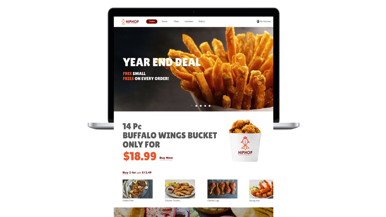
HipHop Fish & Chicken is a fast-food restaurant that specializes in serving customers primarily in Baltimore and other cities across the state of Maryland, USA. Despite offering tasty food and diverse meal plans, HipHop Fish & Chicken's website lacks appeal and frustrates users with its dull design and poor user experience. This project focuses on redesigning the logo and navigation menu pages.
1. Poor discoverability and unclear interaction cues lead to low engagement.
2. Lack of essential features like online ordering affects user satisfaction.
3. Disjointed layout and outdated design hinder quick information retrieval.
4. Violations of fundamental design principles result in a subpar user experience.
5. Addressing these issues is crucial for improving user engagement and website effectiveness.
.png)
During user interviews, 12 participants, including existing customers, frequent online food orderers, and those who visited competitor restaurants, provided valuable insights. Some common pain points identified were:
Our analysis encompassed five different competitor websites within the fast-food industry. Through this process, we identified several key observations.
Varied approaches to website design and user experience: Each competitor website exhibited unique design elements and user interface layouts, reflecting different brand identities and strategies.
Differences in features and functionalities offered: While some competitors provided comprehensive online ordering systems and detailed menu browsing options, others had more limited features or less intuitive navigation.
Opportunities for improvement: Through the analysis, I identified areas where competitor websites could be improved, such as enhancing navigation, optimizing mobile responsiveness, and refining menu presentation to enhance user experience and drive engagement.
.png)

Especially sets of Chicken and Fish icons was hand drawn initially to arrive at a design concept. The chicken head with the comb and the fish body with the caudal fin was finalized to emphasize more on the brand identity.

.png)
After creating and performing 3 rounds of usability testing with low-fidelity prototypes, the design process progressed to developing high-fidelity prototypes.

.png)
.png)
.png)
With enhanced navigation, consistent design, and discoverable elements, the site is more efficient and user-friendly. The visually appealing UI further enhances engagement, making tasks like food ordering effortless.
